The first thing you notice about a space is often the color scheme. In fact, color plays such an important communication role that companies often spend an enormous amount of time and effort specifying color palettes for their product lines. HGTV.com refers to color forecasters as being part designer, part sociologist and part fortune-teller. They draw insights from various industries—fashion runway, auto manufacturers and housewares, for example—to consider what’s happening culturally and how this reflects our national temperament. All of that information is then translated into what colors we’ll be wearing and decorating with in the coming year.
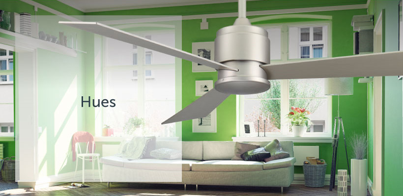
So what’s in now? In one word: hues.
Sophisticated hues of blue, red and green have taken center stage in 2017. From eye-popping bolds to muted pastels, shades of these colors have captured our attention and have been used to set the tone and evoke mood in a space, our fashion, and accessories for self and home. Neutrals have continued to be popular as well, especially in larger purchases like sofas or carpet. Colors like gray or camel last longer and are the perfect complement to evolving color trends.
For 2018, forecasters predict a movement to more intense colors.
“Intense colors seem to be a natural application of our intense lifestyles and thought processes these days,” says Leatrice Eiseman, Pantone Color Institute executive director.
Eiseman says there are the eight color palettes we can expect to see next year:
- Resourceful: This palette is made up of complementary blue and orange colors. “It combines warm and cool tones that you just can’t avoid looking at,” she says.
- Verdure: Vegetal colors like celery and foliage greens are combined with berry-infused purples and eggshell blues, symbolic of health, in this palette.
- Playful: Bright yellow, lime popsicle and other fun ones come together in this color scheme.
- Discretion: Subtle hues such as elderberry and hawthorne rose offer a new sense. “Pink has developed more power than ever before,” says Eiseman.
- Far-fetched: Warm, earthy hues are blended with rosy tones in this category.
- Intricacy: A palette of neutral metallics will become the “new neutrals” of interior design.
- Intensity: This is an eclectic mix of colors that evoke a sense of power and sophistication, all balanced with black and gold.
- TECH-nique: Bright turquoise, pink and purple colors anchored with brilliant whites or frosted almonds give a nod to technology.
How Fanimation interprets color
While our fans at Fanimation tend to stay within a more neutral color spectrum, we pay great attention to the “colors of the year” and how our pieces can provide the perfect finishing touch to a room. Most often, interior designers and homeowners use Fanimation celing fans as an architectural element that pulls a space together, creating ambiance with style and air movement. That’s why we work hard to ensure our designs ebb and flow with the latest trends, color preferences and, ultimately, your personal style.
Source: http://www.elledecor.com/design-decorate/color/a9178549/pantone-colors-2018/